It’s the Dota 2 state of mind: Wildly switching between https://www.esports.net/news/dota/the-international-prize-pool/wild pessimism and maximum optimism, and it’s especially apparent during TI season. While there’s plenty of reasons to be somewhat down on The International 2024 (low viewership, historically low prize pool, etc.), there’s one part of TI13 that definitely surpasses expectations and it’s the incredible stage set for TI13.
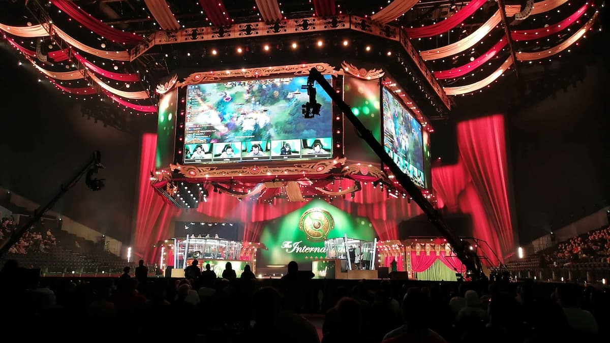
This year’s International has fully embraced the carnival theming laid down by the release of Ringmaster, turning the player’s stage into a circus. It’s hard to tell if you’re watching at home, but there are genuine hand carved and hand painted wood paneling flanking the front of the stage, and hanging above in the rafters.

Image Credit: Esports.net – Michael Hassall
The screen and streamers hanging above the stage reportedly weigh over 100 metric tons, and the combined banners would allegedly run for almost a mile if laid out all in a row. In the arena, it genuinely does feel like a carnival, and the theme really does fit with pro Dota – the spectacle, the side shows (cosplay competition), the audience participation (Slacks and Tsunami rushing into the crowd to ask questions), hosts acting like ring masters, the players… uh… circus performers? The metaphor gets a little thin there at the end.
The casters and commentators: They’re elevated above the TI13 stage in two raised pavilions, meaning fans can peek at the panel and react to the commentary without disrupting things. Similarly the commentators are on the opposite side of the stage, and it really helps to make it feel like a stage show, rather than a dull event.

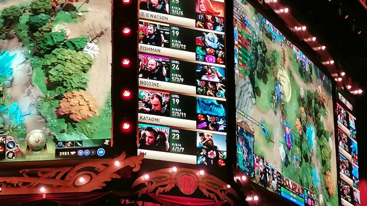
It’s hard to make out, but that’s real wood panelling. Image Credit: Esports.net – Michael Hassall
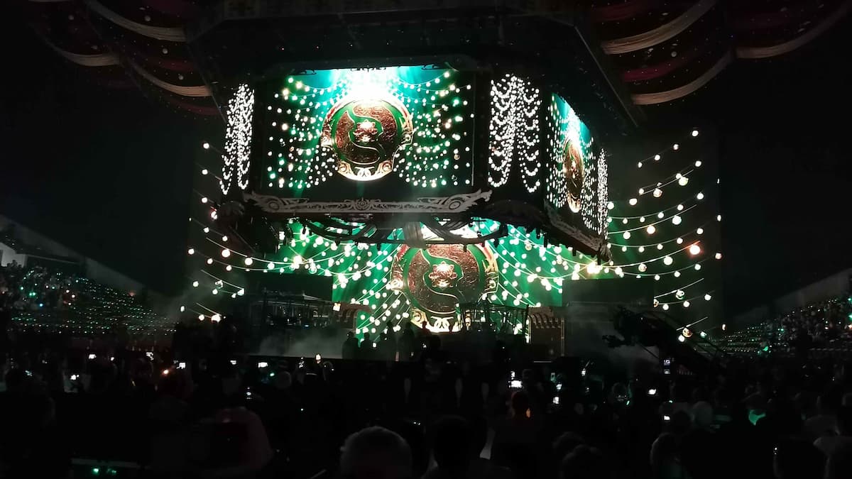
There’s also some hidden details you might not be able to spot at home or in the arena. For instance, the lighting inside the Royal Arena changes each time the game transitions from night to day, bathing the audience in twilight during the night, and beaming in sunlight during the day.
Then there are the wristbands – each seat is given a light-up wristband that lights up with different colors depending on the action on screen. They’ll flash red during kills, or flicker with white lights during the draft. Overall it’s an incredible feeling to be sitting in an arena of twinkling stars.

Image Credit: Esports.net – Michael Hassall
I’ve heard the grumbles of fans during this event: No swag bag for attendees, the ticket prices, the empty seats. But once you’re inside, watching TI13 in-person, it seems like all the complaints melt away and the magic is there once again. TI is still something special, even if it feels like a somewhat scaled down affair. And while the scale shrinks in one aspect, the spectacle of the theming remains.
Which brings to mind another question: What kind of themes could we see in the future? This has been one of the strongest designs for TI in recent memory. TI12’s stained glass was nice, and TI11 was… red? I don’t think it had much of a theme. But with the carnival coming to town for TI13 stage, the doors have been flung open for more concepts, more ideas.
What about a deep sea theme, with streaming blue lights mimicking the light breaking the ocean surface, and having Slark, Slardar, and Naga Siren take center stage? Or something themed after the wild plains of the Deserts of Druud as we learnt about during Crownfall Act 2? There’s a deep well of content to be sourced from the Dota 2 universe, and the themes could be. With TI and the Dota 2 competitive scene contracting (we won’t say dying), it’s easy to
